Aesthetics: Website Must Haves Part 2
How design and usability play a role in your inbound marketing strategy.
Generating a bunch of traffic to your site is great, but does little if your site isn’t helpful for your visitors. Depending on the industry, most websites have a 30-60% bounce rate on average.
This means a significant portion of web traffic entering your website leaves without navigating to any other pages. And many times they may never come back. Yikes! Here are some tips you need to consider to improve user experience and decrease your bounce rate.
The First Impression
 Your website represents who you are and what you offer. When people see it for the first time they’re thinking:
- Does it look credible?
- Can I trust this site?
- Is this a professional company?
- Am I in the right place?
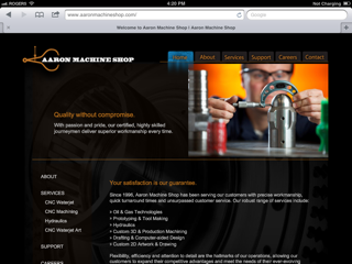
You need to ask yourself all of these questions when evaluating your website. While design is not the most important factor in creating a successful website and often times folks put too much emphasis on how a site looks instead of it works, appearance is the first impression you give to any visitor. If that first impression isn’t a good one, you may have lost an opportunity to gain another customer.
Tips for a great website design:
- Use the right colors for your audience and to draw attention to select elements, not everything.
- Avoid anything unnecessary when it comes to animations, gadgets, and media.
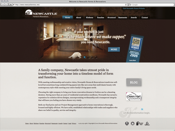
- Create a clear navigation structure and organize page elements in a grid fashion.
- Make sure you use fonts, font sizes, and font colors that are easy to read.
- Maintain consistent elements from page-to-page in order to keep a good flow.
Navigation
Perhaps one of the biggest factors to keep visitors on your website is having a good, solid navigation system that supports all search preferences. If people can’t find what they are looking for, they will give up and leave. Important factors in a site’s navigation include:
- Keeping the structure of your primary navigation simple (and near the top
 of your page).
 - Placing a navigation in the footer of your site.
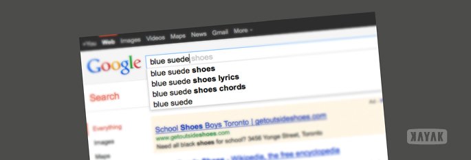
- Include a search box near the top of your site so users can search by keywords.
- Don’t dig too deep – in most cases it’s best to keep your navigation to no more than three levels deep.
- Include links within your page text and make it clear where those links go to. This is also great for SEO!
- Avoid use of complicated JavaScript and especially Flash for your navigation. Many mobile devices can’t see Flash and therefore won’t be able to browse your site.
If you like what you see, contact us today so we can get started revamping your online business.
Inspiration: 25 Website ‘Must Haves’ For Driving Traffic, Leads & Sales, HubSpot


