Will Colour Choice Affect Your Website Visitor Experience?
Colour is a part of everything we do.
From selecting our clothing for the day, to picking out the vehicle we choose to drive, colour makes a continuous impression on us each and every day, but does it have any impact at all on the websites we choose to visit, and if so, why?
The following is a special guest post by Amy Wax, a colour consultant (and creator of the award winning Color 911 app) from New Jersey who regularly surfaces in my Google Plus stream. Feel free to reach out to her directly. Her links and bio can be found at the end of this post. With intros out of the way, let’s take a look at what Amy has to say about the colours on your site…
Why should you care about the colours on your website?
Colour is about more than red white or blue. Colour is sensation. We are conditioned from birth to recognize the colour of something before we learn to read words. In fact, the colours we see can (and do) trigger instant emotions.
What always fascinates me are the cross-cultural, universal physical reactions to colours. As an example, you’ll recognize red as a colour that typically prompts a strong emotional response. Whether the reaction comes from viewing a red sports car in an advertisement, a red cape in a bullfight, or a red tie on an executive, it’s commonplace to interpret such colour display as an expressional of confidence and power.
A related study conducted by the University of Rochester in New York and the University of Utrecht, Utrecht, The Netherlands, measured physical response to select colours. When participants in the study were shown reds, blues, and greys, their physical reactions were measured. The results of the study supported the view that we process colours differently.
What colours are businesses websites using these days to connect with their visitors?
While colour use can go through trends just like everything else, some colours stand the test of time.
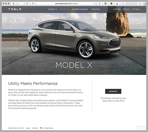
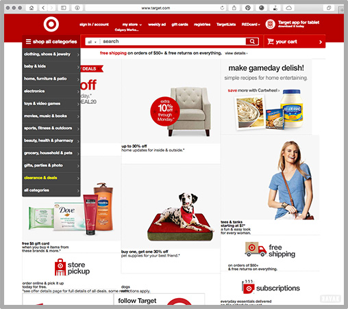
High contrasting blacks and greys with whites are commonly used to communicate sophistication. If there is a more vibrant colour at all, it is applied strategically in one or two places: usually within the image that tells the story, and/or placed into the website in locations that prompt your interaction, such as on buttons or links to guide you towards the next page or action, such as in these examples.
A secondary design colour application is to use large imagery to grab attention and pull viewers in. Still using a lot of white space, with dark grey type.
Some trends advocate no image on the front page preferring more of a text-based story telling approach. I have personally found that a large image makes a bolder statement and is a popular way of using an image to command attention. A pair of examples:
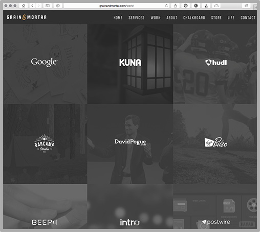
With a larger than life image, designers are faced with the issue of not enough contrast (too busy background) to simply write black text over…
This is solved by using a contrasting light coloured type with a darker colour overlay on the image. A few examples of this approach:
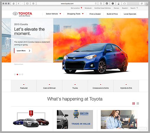
Many consumer websites are using a more dominant supporting colour, the most common being the application of the brand’s colour so as to reinforce their identity. Colours featured prominently in the logo are reinforced throughout the website like in these examples:
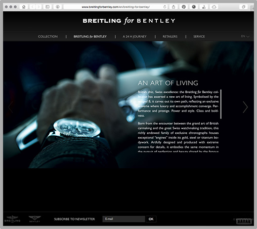
Similarly, a reverse dark treatment using generous open space, san serif fonts and a large image is common for luxury brands. These brands are bold, confident and exude the sense of power. I think you will agree when you see this example, Breitling for Bentley.
Many contemporary websites are incorporating the concepts described above, with large or what seem to be like larger-than-life, images.
Finally I would be remiss if I did not share with you how the popular style of larger images and bold design applies to the younger audience. Gearing towards this age group, a stark black or white background would be pretty boring.
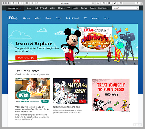
Here are a couple of examples where brighter, exciting imagery would appeal to a younger demographic in a very colourful statement:
It is easy to see in these examples that the colours are an important part of every website design. The amount of white space in the first set of websites draws on the meaning of the colour white being open and forthcoming. The consistent choice of black as a type colour or as a background in the subsequent examples, shows that black shows confidence, and a sense of authority. Certainly in the set of youth-targeted websites, brilliant colours appeal to a younger audience (and the young at heart) drawing them in.
So, if the objective of your website is to convey a meaning or tell a story about a your company’s product or service (it should be), then the job of your design is to incorporate all of the appropriate elements: colour, typography, layout along with a core message to communicate your story in a way that resonates with your visitors.
Choose wisely, make the right choices in creating your website design, and it will all come together to tell the story you want to tell, and your customers want to hear!

About Amy Wax: Amy is a nationally recognized color consultant and has received numerous awards for her expertise in the world of color. She has authored two best sellers (Can’t Fail Color Schemes) and owns the company Your Color Source Studios, Inc. Amy served on the first Residential Design Advisory Board for Benjamin Moore with only 11 other design experts in the United States and Canada. She has also served as a Past President of the International Association of Color Consultants of North America and can be found sharing her love of colour on LinkedIn and in GooglePlus.
{{cta(‘ac3613f0-c1f9-483c-830f-b8bfd655f6ec’)}}

![How to Create Your Buyer Persona [live webinar transcript]](https://kayakwebsites.com/wp-content/uploads/sites/107/2020/09/buyer-personas-iStock-1257975893-768x448.png)


